Data Formats and Dataframes
Questions
How can I manipulate and wrangle dataframes in Julia?
How can I handle missing data in a DataFrame in Julia?
How can I merge data in Julia?
How can I use the Fourier transform to analyze climate data in Julia?
Instructor-note
35 min teaching
30 min exercises
Working with data
We will now explore a Julian approach to a use case common to many scientific disciplines: manipulating data and visualization. Julia is a good language to use for data science problems as it will perform well and alleviate the need to translate computationally demanding parts to another language.
Here we will learn how to work with data using the DataFrames package, visualize it with the Plots and StatsPlots.
DataFrame in Julia
In Julia, a DataFrame is a two-dimensional table-like data structure, similar to a Excel spreadsheet or a SQL table. It is part of the DataFrames.jl package, which provides a powerful and flexible way to manipulate and analyze data in Julia.
A DataFrame consists of columns and rows.

The rows usually represent independent observations, while the columns represent the features (variables) for each observation. You can perform various operations on a DataFrame, such as filtering, sorting, grouping, joining, and aggregating data.
The DataFrames.jl
package offers similar functionality as the pandas library in Python and
the data.frame() function in R.
DataFrames.jl also provides a rich set of functions for data cleaning,
transformation, and visualization, making it a popular choice for
data science and machine learning tasks in Julia. Just like in Python and R,
the DataFrames.jl package provides functionality for data manipulation and analysis.
Download a dataset
We start by downloading a dataset containing measurements of characteristic features of different penguin species.

Artwork by @allison_horst
The dataset is bundled within the PalmerPenguins package, so we need to add that:
Pkg.add("PalmerPenguins")
using PalmerPenguins
We will use DataFrames here to analyze the penguins dataset, but first we need to install it:
Pkg.add("DataFrames")
using DataFrames
Here’s how you can create a new dataframe:
using DataFrames
names = ["Ali", "Clara", "Jingfei", "Stefan"]
age = ["25", "39", "14", "45"]
df = DataFrame(name=names, age=age)
4×2 DataFrame Row │ name age │ String String ────┼──────────────────── 1 │ Ali 25 2 │ Clara 39 3 │ Jingfei 14 4 │ Stefan 45
Dataframes
The following code loads the PalmerPenguins dataset into a DataFrame.
using DataFrames
#Load the PalmerPenguins dataset
table = PalmerPenguins.load()
df = DataFrame(table);
# the raw data can be loaded by
#tableraw = PalmerPenguins.load(; raw = true)

first(df, 5)
344×7 DataFrame
 Row │ species    island     bill_length_mm  bill_depth_mm  flipper_length_mm  body_mass_g  sex
     │ String     String     Float64?        Float64?       Int64?             Int64?       String?
─────┼──────────────────────────────────────────────────────────────────────────────────────────────
   1 │ Adelie   Torgersen            39.1           18.7                181         3750  male
   2 │ Adelie   Torgersen            39.5           17.4                186         3800  female
   3 │ Adelie   Torgersen            40.3           18.0                195         3250  female
   4 │ Adelie   Torgersen       missing        missing              missing      missing  missing
   5 │ Adelie   Torgersen            36.7           19.3                193         3450  female
Note that the table variable is of type CSV.File; the
PalmerPenguins package uses the CSV.jl
package for fast loading of data. Note further that DataFrame can
accept a CSV.File object and read it into a dataframe!
Data can be saved in several common formats such as CSV, JSON, and
Parquet using the CSV, JSONTables, and Parquet2 packages respectively.
An overview of common data formats for different use cases can be found here.
using CSV
CSV.write("penguins.csv", df)
df = CSV.read("penguins.csv", DataFrame)
using JSONTables
using JSON3
open("penguins.json", "w") do io
   write(io, JSONTables.objecttable(df))
end
df = DataFrame(JSON3.read("penguins.json"))
using Parquet2
Parquet2.writefile("penguins.parquet", df)
df = DataFrame(Parquet2.Dataset("penguins.parquet"))
Inspect dataset
Exercise
We can inspect the data using a few basic operations:
# slicing
df[1, 1:3]

# slicing and column name (can also use "island")
df[1:20:100, :island]

# dot syntax (editing will change the dataframe)
df.species

# get a copy of a column
df[:, [:sex, :body_mass_g]]

# access column directly without copying (editing will change the dataframe)
df[!, :bill_length_mm]

# get size
size(df), ncol(df), nrow(df)

# find unique species
unique(df.species)
Summary statistics can be displayed with the describe function:
describe(df)
7×7 DataFrame
 Row │ variable           mean     min     median  max        nmissing  eltype
     │ Symbol             Union…   Any     Union…  Any        Int64     Type
─────┼──────────────────────────────────────────────────────────────────────────────────────────
   1 │ species                     Adelie          Gentoo            0  String
   2 │ island                      Biscoe          Torgersen         0  String
   3 │ bill_length_mm     43.9219  32.1    44.45   59.6              2  Union{Missing, Float64}
   4 │ bill_depth_mm      17.1512  13.1    17.3    21.5              2  Union{Missing, Float64}
   5 │ flipper_length_mm  200.915  172     197.0   231               2  Union{Missing, Int64}
   6 │ body_mass_g        4201.75  2700    4050.0  6300              2  Union{Missing, Int64}
   7 │ sex                         female          male             11  Union{Missing, String}
We can see in the output of describe that the element type of
all the columns is a union of missing and a numeric type. This
implies that our dataset contains missing values.
More about Tidy Data concept can be found in the Python for Scientific Computing training by Aalto Scientific Computing: https://aaltoscicomp.github.io/python-for-scicomp/pandas/#tidy-data
We can remove these missing values by the dropmissing or dropmissing! functions
(what is the difference between them?):
dropmissing!(df)
Alternatively, we can use:
# Missing data
# Replacing missing values with a specific value
df = coalesce.(df, 0)
The code shows how to handle missing data in the bill_length_mm column by replacing missing values with a specific value using the coalesce function or by interpolating missing values using the Interpolations package.
# Interpolating missing values
using Interpolations
mask = ismissing.(df.bill_length_mm)
itp = interpolate(df[!, :bill_length_mm][.!mask], BSpline(Linear()))
df[!, :bill_length_mm][mask] .= itp.(findall(mask))
mask = ismissing.(df.bill_length_mm): This line is creating a logical mask that is true wherever there are missing values (NaN) in the bill_length_mm column and false elsewhere.
itp = interpolate(df[!, :bill_length_mm][.!mask], BSpline(Linear())): This line is creating an interpolation object itp. It’s using only the non-missing values of the bill_length_mm column (specified by df[!, :bill_length_mm][.!mask]) and a linear B-spline interpolation method (BSpline(Linear())).
df[!, :bill_length_mm][mask] .= itp.(findall(mask)): This line is replacing the missing values in the bill_length_mm column with the interpolated values. It’s finding the indices of the missing values with findall(mask) and then using the interpolation object itp to estimate values at these indices.
So, in summary, this code is filling in missing values in the bill_length_mm column by estimating their value based on a linear interpolation of the non-missing values. This can be a useful way to handle missing data when you don’t want to or can’t simply ignore those missing values. 😊
(Optional) Long vs Wide Data Format
The data is in a so-called wide format.
In data analysis, we often encounter two types of data formats: long format and wide format. https://www.statology.org/long-vs-wide-data/
Long format: In this format, each row is a single observation, and each column is a variable. This format is also known as “tidy” data.
Wide format: In this format, each row is a subject, and each column is an observation. This format is also known as “spread” data.
The DataFrames.jl package provides functions to reshape data between long and wide formats. These functions are stack, unstack, melt, and pivot.
Further examples can be found in the official documentation.
# To convert from wide to long format

#First we create an ID column
df.id = 1:size(df,1)
df_long = stack(df, Not(:species, :id))

# To convert from long to wide format
df_wide = unstack(df_long, :variable, :value)

# or
# Custom combine function
function custom_combine(x)
   if eltype(x) <: Number
      return mean(skipmissing(x))
   else
      return first(skipmissing(x))
   end
end

# Unstack DataFrame with custom combine function
unstack(df_long, :species, :variable, :value, combine = custom_combine)
Split-apply-combine workflows
Oftentimes, data analysis workflows include three steps:
Splitting/stratifying a dataset into different groups;
Applying some function/modification to each group;
Combining the results.
This is commonly referred to as “split-apply-combine” workflow, which can be
achieved in Julia with the groupby function to stratify and
the combine function to aggregate with some reduction operator.
An example of this is provided below:
using Statistics

# Split-apply-combine
df_grouped = groupby(df, [:species, :island])
df_combined = combine(df_grouped, :body_mass_g => mean)
In this example, groupby(df, [:species, :island]) groups the DataFrame by the species and island columns.
Then, combine(df_grouped, :body_mass_g => mean) calculates the mean of the :body_mass_g column for each group.
The mean function is used for aggregation.
The result is a new DataFrame where each unique :species-:island combination forms a row,
and the mean body mass for each species-island combination fills the DataFrame.
(Optional) Creating and merging DataFrames
Creating DataFrames
In Julia, you can create a DataFrame from scratch using the DataFrame constructor from the DataFrames package.
This constructor allows you to create a DataFrame by passing column vectors as keyword arguments or pairs.
For example, to create a DataFrame with two columns named :A and :B, the following works:
DataFrame(A = 1:3, B = ["x", "y", "z"])
A DataFrame can also be created from other data structures such as dictionaries, named tuples, vectors of vectors, matrices, and more. You can find more information about creating DataFrames in Julia in the official documentation
Merging DataFrames
Also, you can merge two or more DataFrames using the join function from the DataFrames package.
This function allows you to perform various types of joins, such as inner join, left join, right join, outer join, semi join, and anti join.
You can specify the columns used to determine which rows should be combined during a join by passing them as the on argument to the join function.
For example, to perform an inner join on two DataFrames df1 and df2 using the :ID column as the key, you can use the following code:
join(df1, df2, on = :ID, kind = :inner).
You can find more information about joining DataFrames in Julia in the official documentation.
Plotting
Let us now look at different ways to visualize this data. Many different plotting libraries exist for Julia and which one to use will depend on the specific use case as well as personal preference.
We will be using Plots.jl and StatsPlots.jl but we encourage to explore these other packages to find the one that best fits your use case.
First we install Plots.jl and StatsPlots backend:
Pkg.add("Plots")
Pkg.add("StatsPlots")
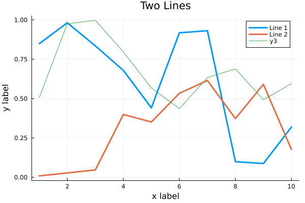
Here’s how a simple line plot works:
using Plots
gr()  # set the backend to GR

x = 1:10; y = rand(10, 2)
plot(x, y, title = "Two Lines", label = ["Line 1" "Line 2"], lw = 3)
In VSCode, the plot should appear in a new plot pane. We can add labels:
xlabel!("x label")
ylabel!("y label")
To add a line to an existing plot, we mutate it with plot!:
z = rand(10)
plot!(x, z)
Finally we can save to the plot to a file:
savefig("myplot.png")
myplot.png
Multiple subplots can be created by:
y = rand(10, 4)

p1 = plot(x, y); # Make a line plot
p2 = scatter(x, y); # Make a scatter plot
p3 = plot(x, y, xlabel = "This one is labelled", lw = 3, title = "Subtitle");
p4 = histogram(x, y); # Four histograms each with 10 points? Why not!
plot(p1, p2, p3, p4, layout = (2, 2), legend = false)
Visualizing the Penguin dataset
First load Plots and set the backend to GR (precompilation of Plots
might take some time):
using Plots
gr()
For the Penguin dataset it is more appropriate to use scatter plots, for example:
scatter(df[!, :bill_length_mm], df[!, :bill_depth_mm])
We can adjust the markers by this list of named colors and this list of marker types:
scatter(df[!, :bill_length_mm], df[!, :bill_depth_mm], marker = :hexagon, color = :magenta)
We can also change the plot theme according to this list of themes, for example:
theme(:dark)
# then re-execute the scatter function
We can add a dimension to the plot by grouping by another column. Let’s see if
the different penguin species can be distiguished based on their bill length
and bill depth. We also set different marker shapes and colors based on the
grouping, and adjust the markersize and transparency (alpha). Note that
it is also possible to prescribe a palette rather than every colour individually, with
many common palettes available here:
scatter(df[!, :bill_length_mm],
        df[!, :bill_depth_mm],
        xlabel = "bill length (mm)",
        ylabel = "bill depth (mm)",
        group = df[!, :species],
        marker = [:circle :ltriangle :star5],
        color = [:magenta :springgreen :blue],
        markersize = 5,
        alpha = 0.8
        )
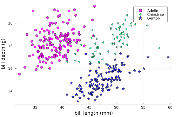
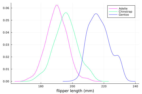
The scatter function comes from the base Plots package. StatsPlots provides
many other types of plot types, for example density. To use dataframes with StatsPlots
we need to use the @df macro which allows passing columns as symbols (this can also be used
for scatter and other plot functions):
using StatsPlots

@df df density(:flipper_length_mm,
               xlabel = "flipper length (mm)",
               group = :species,
               color = [:magenta :springgreen :blue],
               )
Exercises
Create a custom plotting function
Convert the final scatter plot in the type-along section “Visualizing the Penguin dataset”
and convert it into a create_scatterplot function:
The function should take as arguments a dataframe and two column symbols.
Use the
minimum()andmaximum()functions to automatically set the x-range of the plot using thexlim = (xmin, xmax)argument toscatter().If you have time, try grouping the data by
:islandor:sexinstead of:species(keep in mind that you may need to adjust the number of marker symbols and colors).If you have more time, play around with the plot appearance using
theme()and the marker symbols and colors.
Solution
function create_scatterplot(df, col1, col2, groupby)
    xmin, xmax = minimum(df[:, col1]), maximum(df[:, col1])
    # markers and colors to use for the groups
    markers = [:circle :ltriangle :star5 :rect :diamond :hexagon]
    colors = [:magenta :springgreen :blue :coral2 :gold3 :purple]
    # number of unique groups can't be larger than the number of colors/markers
    ngroups = length(unique(df[:, groupby]))
    @assert ngroups <= length(colors)

    scatter(df[!, col1],
            df[!, col2],
            xlabel = col1,
            ylabel = col2,
            xlim = (xmin, xmax),
            group = df[!, groupby],
            marker = markers[:, 1:ngroups],
            color = colors[:, 1:ngroups],
            markersize = 5,
            alpha = 0.8
            )
end

create_scatterplot(df, :bill_length_mm, :body_mass_g, :sex)
create_scatterplot(df, :flipper_length_mm, :body_mass_g, :island)
Working with DataFrames in Julia
In this exercise, you will practice reading data from CSV files into DataFrames, manipulating data in DataFrames, and visualizing data using a plotting package.
Install the CSV and DataFrames packages by running the following commands in the Julia REPL:
using Pkg
Pkg.add("CSV")
Pkg.add("DataFrames")
2. Set the relative path to the DailyDelhiClimateTest.csv and DailyDelhiClimateTrain.csv files in the path_test and path_train variables. Assume that the path to your files is juliaforhpda/data and you are currently in the juliaforhpda/ directory in the Julia REPL. The data is available here: https://github.com/ENCCS/julia-for-hpda/blob/main/content/data/DailyDelhiClimateTest.csv and https://github.com/ENCCS/julia-for-hpda/blob/main/content/data/DailyDelhiClimateTrain.csv
This climate data set contains daily mean temperature, humidity, wind speed and mean pressure at a location in Dehli India over a period of several years. The data set was downloaded from here.
Read the data from the CSV files into DataFrames named df_test and df_train using the CSV.read function.
Use the functions provided by the DataFrames package to manipulate the data in the DataFrames. For example, you can select columns, filter rows, group data, compute summary statistics, and compute aggregate functions.
Install a plotting package such as Plots or Gadfly by running the following command in the Julia REPL:
using Pkg
Pkg.add("Plots")
Use the plotting package to create a line plot of the mean of the meantemp column for each group in a grouped DataFrame. Customize the appearance of the plot by changing its properties such as color, line style, marker style, etc.
Solution
Here is one possible solution to this exercise:
Once you have read the data from the CSV files into DataFrames, you can manipulate the data using the functions provided by the DataFrames package. Here are some examples that show how to manipulate data in a DataFrame:
using CSV

# Set relative path to CSV files
path_test = "data/DailyDelhiClimateTest.csv"
path_train = "data/DailyDelhiClimateTrain.csv"

# Read data from CSV files into DataFrames
df_test = CSV.read(path_test, DataFrame)
df_train = CSV.read(path_train, DataFrame)

using DataFrames

# Select columns
df_test_selected = select(df_test, :meantemp, :humidity)

# Filter rows
df_test_filtered = filter(:meantemp => x -> x > 20, df_test)

# Group data
df_test_grouped = groupby(df_test, :date)

# Compute summary statistics
describe(df_test)

# Compute aggregate functions
combine(df_test_grouped, :meantemp => mean)
This code shows how to select columns, filter rows, group data, compute summary statistics, and compute aggregate functions on a DataFrame named df_test. You can use these and other functions provided by the DataFrames package to manipulate the data in the DataFrame.
julia> combine(df_test_grouped, :meantemp => mean)
ERROR: UndefVarError: `mean` not defined
Stacktrace:
[1] top-level scope
   @ REPL[39]:1
The mean function is part of the Statistics standard library module in Julia. To use the mean function, you need to load the Statistics module by running using Statistics. Here is an example that shows how to compute the mean of the meantemp column for each group in a grouped DataFrame:
using Statistics

# Compute mean of meantemp column for each group
combine(df_test_grouped, :meantemp => mean)
This code loads the Statistics module and uses the mean function to compute the mean of the meantemp column for each group in a grouped DataFrame named df_test_grouped.
What can we do with this mean, maybe vizualize?
Yes, you can visualize the mean of the meantemp column for each group in a grouped DataFrame using a plotting package such as Plots or Gadfly.
Here is an example that shows how to create a bar plot of the mean meantemp values for each group using the Plots package:
using Plots

# Compute mean of meantemp column for each group
df_test_mean = combine(df_test_grouped, :meantemp => mean)

# Create bar plot of mean meantemp values for each group
p = bar(df_test_mean.date, df_test_mean.meantemp_mean, xlabel="Date", ylabel="Mean Temperature", label="Mean Temperature")

# Display plot
display(p)
This code computes the mean of the meantemp column for each group in a grouped DataFrame named df_test_grouped and stores the result in a new DataFrame named df_test_mean. It then uses the bar function from the Plots package to create a bar plot of the mean meantemp values for each group. The x-axis shows the date and the y-axis shows the mean temperature.
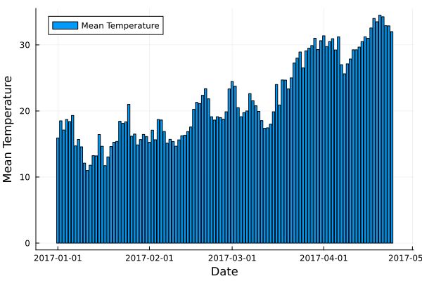
plot.png
# Create line plot of meantemp means
plot(df_test_mean.date, df_test_mean.meantemp_mean, label="Mean Meantemp", xlabel="Date", ylabel="Meantemp (°C)", title="Mean Meantemp by Date")
I hope this exercise helps you practice working with DataFrames in Julia!
Working with the Fourier Transform in Julia
In this exercise, you will practice computing the Fourier transform of climate data using the FFTW package in Julia.
Install the FFTW package by running the following command in the Julia REPL:
using Pkg
Pkg.add("FFTW")
2. Read the data from the DailyDelhiClimateTest.csv and DailyDelhiClimateTrain.csv files into DataFrames named df_test and df_train using the CSV.read function.
Compute the Fourier transform of the meantemp column in the df_test DataFrame using the fft function from the FFTW package.
Compute the frequencies corresponding to each element of the Fourier transform using the fftfreq function.
Plot the magnitude of the Fourier transform against the frequencies to visualize the frequency spectrum of the signal.
Solution
Here is one possible solution to this exercise:
# using DataFrames
using FFTW
using Plots

# Set relative path to CSV files
path_test = "data/DailyDelhiClimateTest.csv"
path_train = "data/DailyDelhiClimateTrain.csv"

# Read data from CSV files into DataFrames
df_test = CSV.read(path_test, DataFrame)
df_train = CSV.read(path_train, DataFrame)

# Compute Fourier transform of meantemp column
meantemp_fft = fft(df_test.meantemp)

# Compute frequencies
n = length(meantemp_fft)
freq = fftfreq(n)
114-element Frequencies{Float64}:
0.0
0.008771929824561403
0.017543859649122806
0.02631578947368421
0.03508771929824561
0.043859649122807015
0.05263157894736842
⋮
-0.05263157894736842
-0.043859649122807015
-0.03508771929824561
-0.02631578947368421
-0.017543859649122806
-0.008771929824561403
This code uses the fft function from the FFTW package to compute the discrete Fourier transform of the meantemp column in a DataFrame named df_test. It also uses the fftfreq function to compute the frequencies corresponding to each element of the Fourier transform.
Once you have computed the Fourier transform of the data, you can use it to analyze the frequency content of the signal. For example, you can plot the magnitude of the Fourier transform to visualize the dominant frequencies in the signal.
The Fourier transform is a mathematical tool that decomposes a signal into its constituent frequencies. It converts a function from the time domain into the frequency domain, where the output is a complex-valued function of frequency. The magnitude of the Fourier transform represents the contribution of each frequency component to the original signal. In other words, it shows how much of each frequency is present in the original signal. The magnitude is usually plotted against the frequencies to visualize the frequency spectrum of the signal.
Fourier transform can be used to analyze climate data in many ways. For example, it can help identify patterns and periodicities in the data, such as seasonal cycles or other recurring phenomena. By decomposing the signal into its frequency components, the Fourier transform can highlight the dominant frequencies present in the data and help understand the underlying processes that drive climate variability. For example, a study used wavelet local multiple correlation (WLMC) to analyze relationships among several large-scale reconstructed climate variables characterizing North Atlantic: i.e. sea surface temperatures (SST) from the tropical cyclone main developmental region (MDR), the El Niño-Southern Oscillation (ENSO), the North Atlantic Multidecadal Oscillation (AMO), and tropical cyclone counts (TC).
References: (1) Fourier transform - Wikipedia. https://en.wikipedia.org/wiki/Fourier_transform (2) Fourier Transform – from Wolfram MathWorld. https://mathworld.wolfram.com/FourierTransform.html (3) Lecture 8: Fourier transforms - Scholars at Harvard. https://scholar.harvard.edu/files/schwartz/files/lecture8-fouriertransforms.pdf (4) NCL: Simple Fourier Analysis of Climate Data - NCAR Command Language (NCL). https://www.ncl.ucar.edu/Applications/fouranal.shtml (5) Dynamic wavelet correlation analysis for multivariate climate time …. https://www.nature.com/articles/s41598-020-77767-8 (6) NASA Global Daily Downscaled Projections, CMIP6 | Scientific Data - Nature. https://www.nature.com/articles/s41597-022-01393-4
Here is an example that shows how to create a bar plot of the mean meantemp values for each group using the Plots package:
using Plots
# Compute magnitude of Fourier transform
meantemp_fft_mag = abs.(meantemp_fft)

# Create plot of magnitude of Fourier transform against frequencies
p = plot(freq, meantemp_fft_mag, xlabel="Frequency", ylabel="Magnitude", label="Magnitude of Fourier Transform")

# Display plot
display(p)

savefig("ft.png")
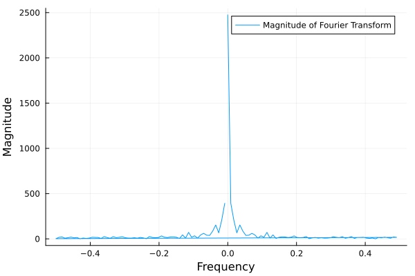
ft.png
I hope this exercise helps you practice working with the Fourier transform in Julia!
See also
- You can create interactive 3D scatter plots in Julia using the PlotlyJS package.